display
grid - block level grid
inline-grid - inline-level grid
  .container {
    display: grid / inline grid;
  }
grid-column-start
grid-column-end
grid-row-start
grid-row-end
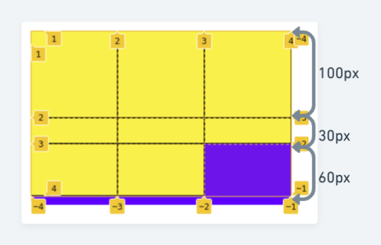
Determine grid items location based on speicific grid line numbers.

  .item1 {
    grid-column-start: 1; /* first line in column */
    grid-column-end: 3; /* third line in column */
  }

  .item1 {
    grid-row-start: 1;
    grid-row-end: 3;
  }
Shorthand
  grid-column: grid-column-start grid-column-end;
  grid-row: grid-row-start grid-row-end;
align-self

  .item1 {
    align-self: start / center / estretch;
  }
justify-items

  .container {
    justify-items: start / center / end / stretch;
  }
align-items

  .container {
    align-items: start / center / end / stretch;
  }
In Cascading Style Sheets, CSS grid layout or CSS grid creates complex responsive web design grid layouts more easily and consistently across browsers. Historically, there have been other methods for controlling web page layout methods, such as tables, floats, and more recently, CSS Flexible Box Layout (Flexbox). CSS grid is currently not an official standard (it is a W3C Candidate Recommendation) although it has been adopted by the recent versions of all current major browsers
- Source: Wikipedia
grid-template-columns
grid-template-rows
It defines the line names and track size of the grid rows/ columns.

  .container {
    grid-template-columns: 60px 150px 70px;
  }

  .container {
    grid-template-rows: 100px 30px 60px;
  }
repeat(3, 1fr) means 3 rows/cols will take 1 fraction unit of available space.
  .container {
    grid-template-rows: repeat(3, 1fr);
    grid-template-cols: repeat(3, 1fr);
  }
column-gap
row-gap

  .container {
    row-gap: 7px;
    column-gap: 5px;
  }
Shorthand
gap: row-gap col-gap;
justify-self

            .item1 {
              justify-self: start / center / end / stretch;
            }
place-self
place-self = align-self + justify-self

  .item1 {
    place-self: center / stretch;
  }
place-items
place-items = align-items + justify-items

  .container {
    place-items: center;
  }